Options
User Experience
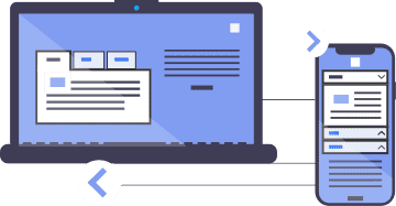
The widget can be displayed as a non‑responsive TabPanel, a responsive TabPanel, or an Accordion.
There are two options for handling state persistence.
Look and Feel
The TabPanel offers four different "skins" (default, fancy, pills, bar), and the stylesheet is easily customizable.
This link is here to test keyboard navigation.Semantic
Progressive enhancement
The Widget is markup-agnostic, eliminating the need for jump-links.
The document remains meaningful even without JavaScript support.
This link is here to test keyboard navigation.A11Y
First class support for screen-reader users
ARIA controls the rendering of their non-visual experience.
Headings functioning as tabs facilitate easier navigation through the Widget for screen reader users.
First class support for keyboard users
Users can navigate through accordion headings using the up/down arrow keys.
They can skip the entire Widget or access its first tab/header directly.
State Management
Reloading, bookmarking, or sharing a page preserves the state of the panels.
Text selection
Adjacent headings are not selected when users select a heading (tab) and its related content (panel). This is possible because headings are not siblings, unlike headings in a "regular" tablist.
This link is here to test keyboard navigation.Adaptive
Responsiveness
The widget transforms into an Accordion when its width cannot accommodate all the tabs.
This adaptive feature prevents layout issues on narrow viewports, within fluid containers, and with large font-size settings.
Internationalization (i18n)
The widget adjusts to different languages (e.g., "Technischer Support" versus "Tech Support").
The widget adheres to the directionality of the text (tabs will switch direction accordingly). Icon positioning will also respect the script direction.
This link is here to test keyboard navigation.Reduced test cases
